After writing about the lottery the other week, I am following up with another avid reader (2xParkedie) inspired post. Please keep them coming (2xParked@gmail.com).
This time, I was shared an interesting article from the Washington Post. WaPo used data to determine which of the states is most representative of the United States.
2xParked asked the question: what area of New York is most representative of the City? Let’s find out.
The Data
Kudos to Andrew Van Dam — the WaPo author — for providing an easy-to-follow blue print.
In this analysis, I used the 2018-2022 5-Year dataset from the American Community Survey. Unlike the Census and its infrequent cadence, the ACS provides a bridge of estimates between decades. Instead of splitting by state, I split by Zip Code in New York City.
I chose elements which, as Van Dam notes, are highly correlated with voting preferences. I did not include religion in this analysis since it is not available in the ACS.
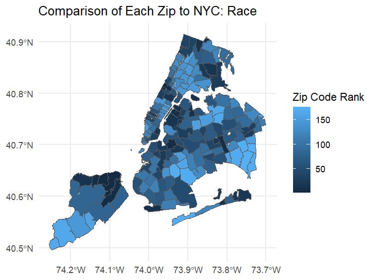
I am going to keep writing to a minimum. Unlike the last few 2xParked, this will be more data heavy, so enjoy looking at these charts: the darker the color, the more similar the zip code is to NYC on average. How does your area compare?
By Race/Ethnicity
I used similar components as WaPo to determine the race and ethnicity of each zip code: % White, % Black, % Asian, % Native American, and % Hispanic.
By Income
I split income into buckets — from low to high — as defined here, and I determined which zips had similar distributions.
By Occupation
As Van Dam notes in the article, salary and occupation — e.g. construction, service, sales — are not always correlated (r = 0.32 in this case). Occupation is often representative of education though, which was left out due to my computer yelling at me as I pulled that data.
Social Views
“Social View” is tough to define, so I followed the lead of Van Dam in choosing metrics. I include % of households with a same-sex couple, % of the population who is a veteran, and the median age. I acknowledge there are many holes in these assumptions, but given the lack of available data, this serves as a proxy.
So What You Actually Want to Know
I combined these scores together slightly differently than Van Dam did. He used weights based on importance in predicting voting patterns. I did not do that. First, his weights might not apply from a national level to a hyper local level. Second, the rankings above are decently correlated between each other, so there might be some double counting when combining in Van Dam’s methodology. I instead used weights from a statistical technique called principle components analysis to quickly combine.
Like when you are flying down to LaGuardia, can you see your home from here? How similar is it to New York City as a whole? My home is not even close to being representative with its bright blue hue.
Below are the most similar and least similar zip codes to the aggregated city. I hypothesize if you asked an average New Yorker which area they thought would be most representative of the city, a likely guess would be Astoria. Good guess.
The top zip in Brooklyn is Kensington/Windsor Terrace, the top zip in Manhattan is Hamilton Heights, the top zip in the Bronx is Kingsbridge, and the top zip in Staten Island is St. George/Tompkinsville.
If you are interested in looking from a neighborhood view — i.e. aggregated zip codes — I used this classification. It is not perfect, but it aggregates pretty nicely from a zip code perspective, which is not always easy. For example, Brooklyn Heights and Cobble Hill have the same zip, but are considered different neighborhoods — especially by those who live there.
Finally, Staten Island is the most representative borough, followed closely by Brooklyn and Queens. The Bronx is by far the most unique.
Final Thoughts
I found this to be a fun and thoughtful exercise. In a WFH post-Covid world, where we spend much of our time in our respective neighborhoods, being aware of the other 8M New Yorkers is just a little bit more difficult. As we enter election season — in NYC, it is a two year deal — we should not be surprised if popular NYC candidates differ from our inner circle’s views.
Happy Memorial Day Weekend and the unofficial start to summer. Expect more great content soon.


