


The final rezoning of New York’s congressional districts means New Yorkers can expect campaigns usually reserved for the mayoral election. Debating which battle should receive top billing is as interesting a conversation as the campaigns themselves. We will see rumbles featuring the who’s who of NYC politics, making the midterms more a season of Survivor All Stars than a Sorkin drama.
When the 2020 Census tally indicated that New York lost a congressional seat, it was only natural that chaos would follow. Having the maps redrawn and court reviewed added more fuel to the fire.
According to the US Census:
Each congressional district is to be as equal in population to all other congressional districts in a state as practicable. The boundaries and numbers shown for the congressional districts are those specified in the state laws or court orders establishing the districts within each state.
How hard can drawing a map be? I decided to create my own NY congressional districts with the data available.
The Process
Using data from the most recent US Census and American Community Survey, I was able to create a comprehensive dataset at the zip code level. (Note: Don’t be the person who says “zip codes were not designed to be used this way.” Without household data, splitting the state into over 1,000 unique areas is the best we can do.)
I kept it simple. Instead of using the kitchen sink of data, I used three distinct features which encompass much of the socio-demographic and economic information of an area: income, age, and race/ethnicity.
Before using a basic clustering method (hierarchical clustering using Ward’s method), I had two restraints. I tried to keep congressional districts as geographically intact as possible, even if it made more sense that a community near Buffalo might be better served to be grouped with a community near Albany.
I also tried to distribute the populations evenly. With ~20 million New Yorkers and 26 congressional seats, this means about 750k people represented per seat. Given the granularity of the data, I mostly constrained each district to having between 375k (1/2 x 750k) and 1.5M (2 x 750k) people.
The Results
Below would be the new congressional districts if the model were in charge.

What is more interesting is after I applied the latest registered party enrollment data:

The result would be a Democrat advantage of 18-8. Depending on whichever party had the momentum, you could add/remove 3 seats. If you believe Republicans have the advantage for this upcoming midterm election, then this redistrict indicates it could potentially be a slight 15-11 Democrat advantage.
Let’s zoom in to take a closer look at the NYC districts.
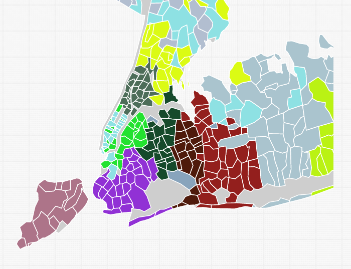
The band of Manhattan south of Harlem, Brownstone Brooklyn, the northern stretch of the G-Train, and Astoria are fluid with one another.
We also see some discontinuity in the Bronx/Westchester and Queens/Nassau borders, indicating this is another area which has flexibility in the way it can be drawn.
Staten Island would get its own congressperson and not have to share with Brooklyn.
Lessons Learns
This by no means definitively says I am better than the professionals. Rather, it is an exercise to understand what map drawing is like.
This exercise did teach:
Drawing districts is really hard. Even if I were to use all the data from the latest Census, the constraints of (1) geographic connection and (2) population size cause a lot of fuzzy lines. The only way to draw correctly is to be like Wyoming and have only 1 representative.
Not everyone will be happy. Because of this lack of concrete borders, someone will inevitably find a reason to complain about how the maps are drawn.
Subjectivity is unavoidable. The fuzziness at the borders means that objective methods have their limits, and subjectivity (even if its attempted objectively) is inevitable.
Gerrymandering is not only a possibility, but when boundaries are drawn in a opportunistic way by a sensible logic, the resulting map might actually not be wrong. I have to emphasize (2) the phrase “sensible logic” and (2) that “not being wrong” does not mean “being right.”
Have fun in primary season. Take lots of selfies!
To subscribe to future or check out past newsletters, click here.
For more content, follow 2xParked on Twitter @2xParked.
Comments? Suggestions? Questions? Email me at 2xParked@gmail.com.